- Branding
- Website
- Brand Extensions
- Brand Positioning
- Visual Identity
A bold entrance into a crowded market
Founded by seasoned HR consulting professionals with experience at industry leaders like Korn Ferry and Michael Page, Lagrange Point entered an established market with a clear ambition: to make an impression from day one. The brand needed to command attention while conveying the credibility, expertise and gravitas expected of a firm built on years of industry experience.


The Approach
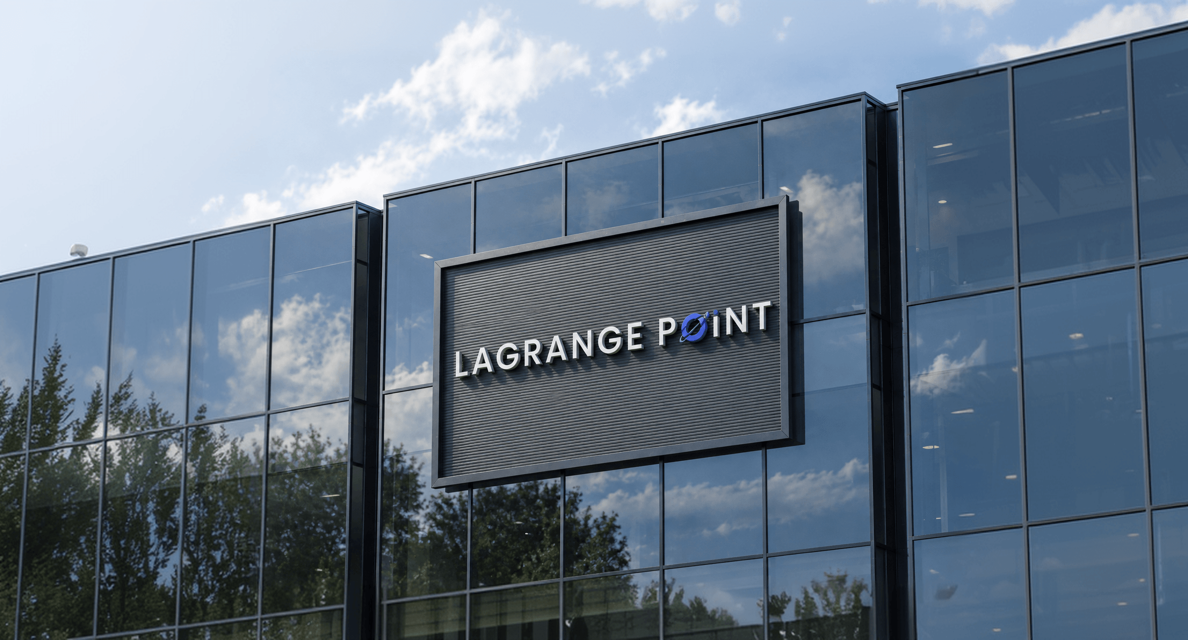
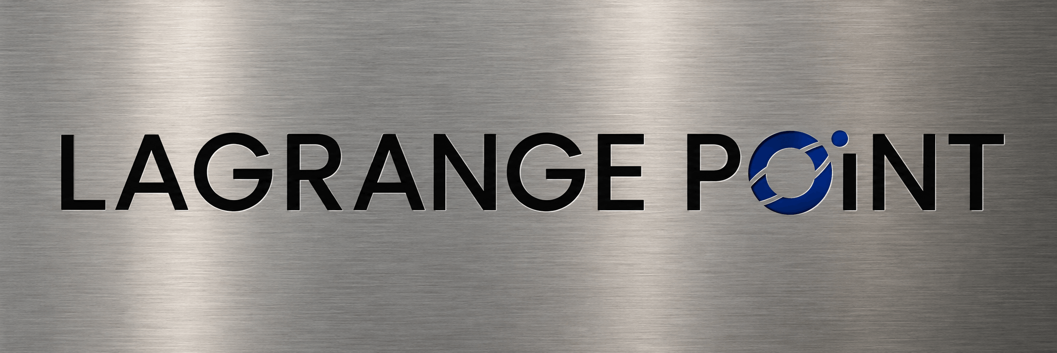
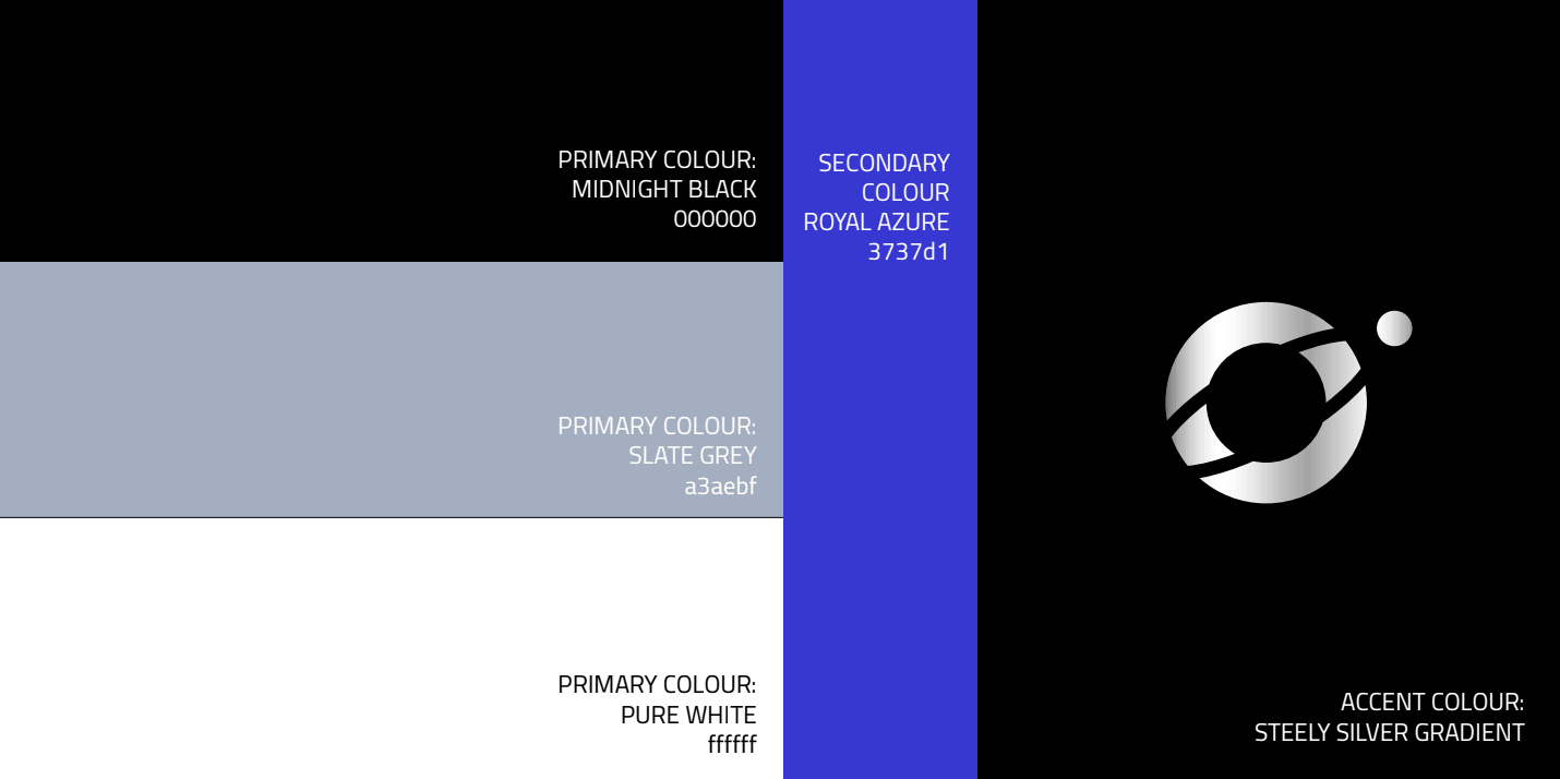
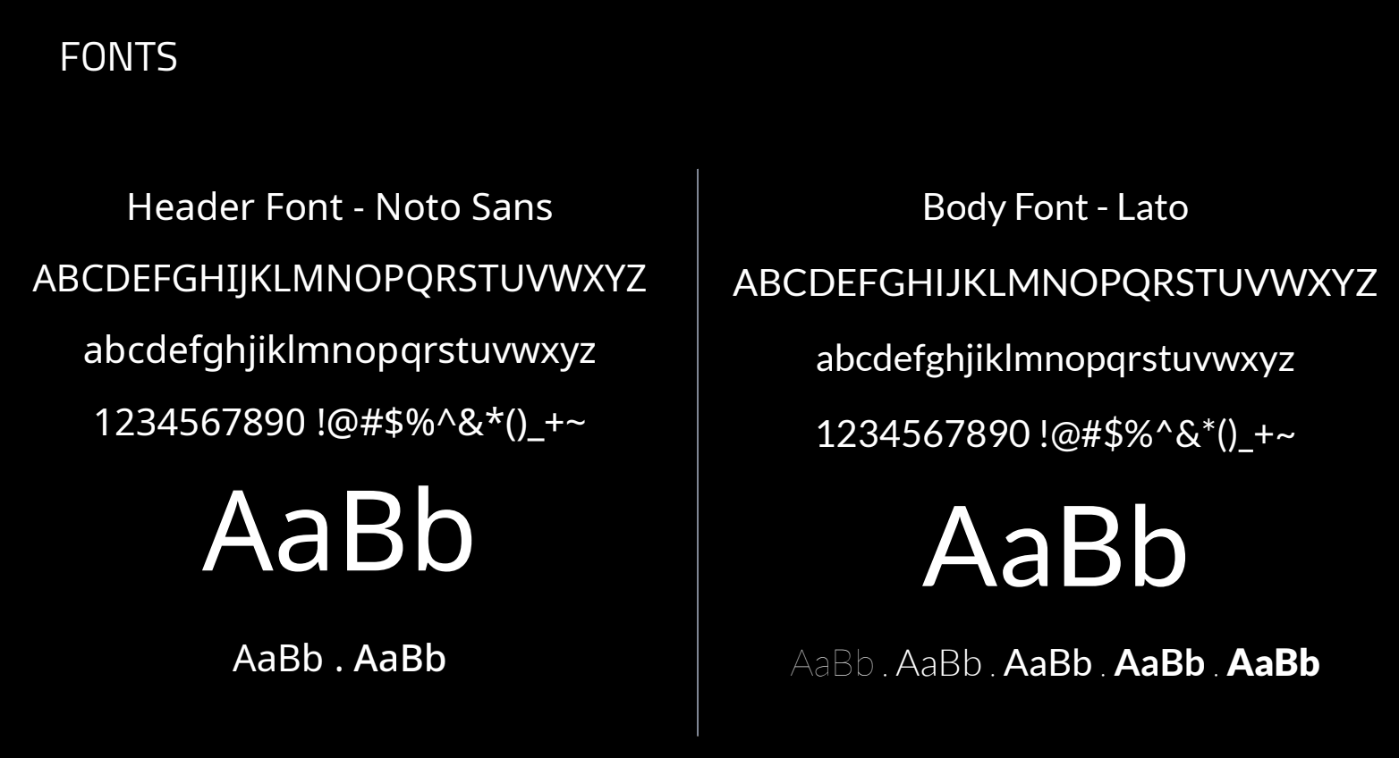
Project 1.6 set out to build a visual identity that balanced boldness with authority. Inspired by the orbital mechanics of Lagrange points in space, the logo captures the idea of balance, positioning and strategic advantage. A classic palette of blue, black and grey established a foundation of professionalism, while an intense galaxy blue brought energy and distinction to the brand.
The Outcome
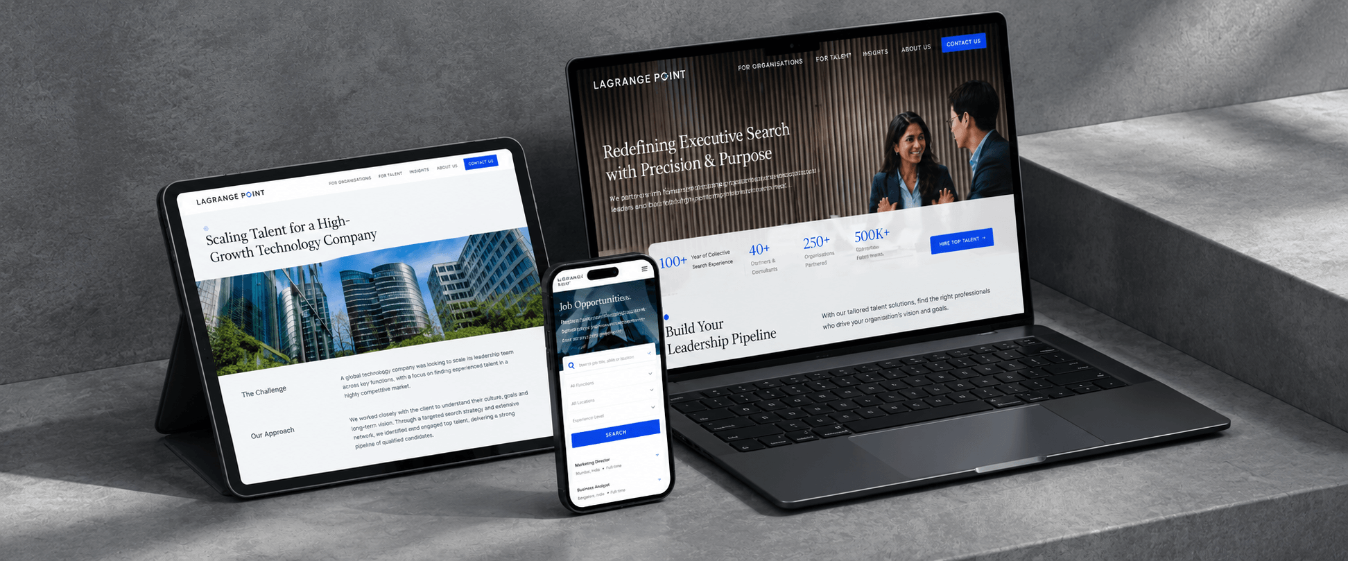
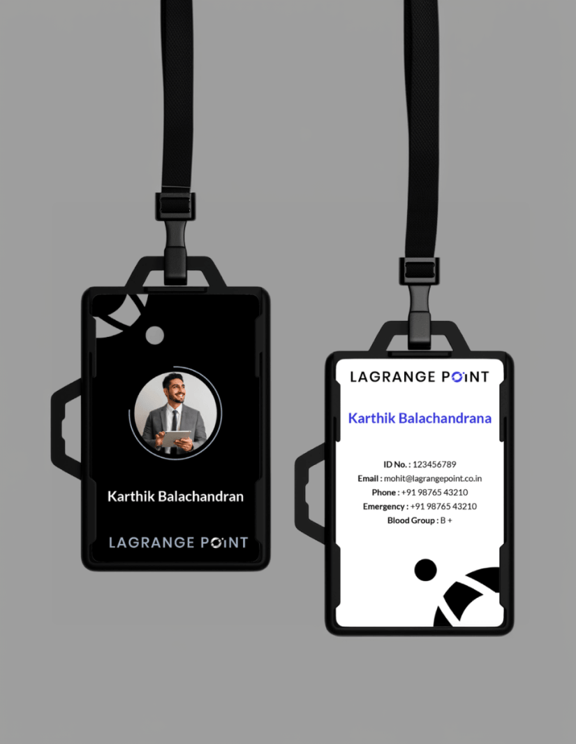
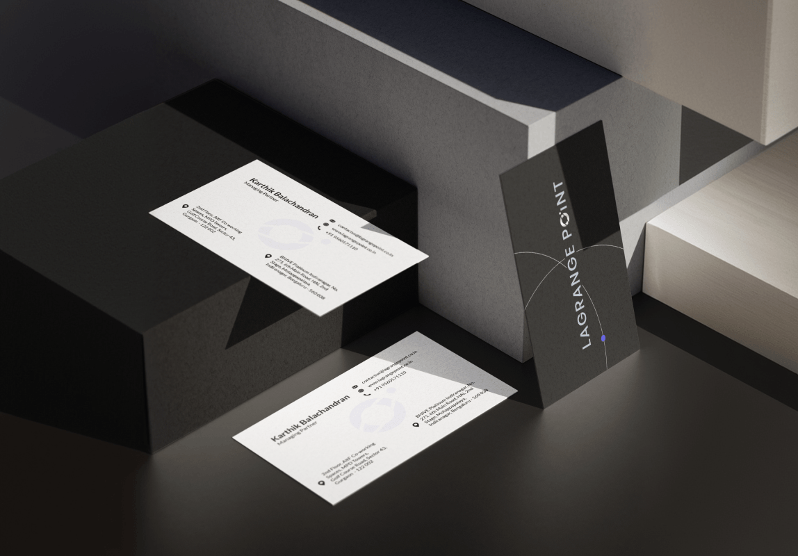
We translated the visual identity into a cohesive brand experience across the website and key brand touchpoints, including ID cards, virtual meeting backdrops, presentation decks and LinkedIn banners. Every element worked together to build recognition and reinforce a consistent, confident presence. The result was a brand built to make a strong first impression, combining the gravitas of industry veterans with the ambition of a new player ready to claim its place in the market.